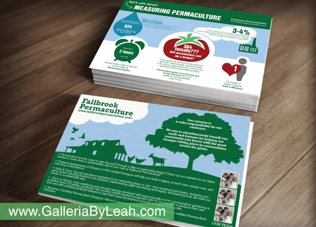
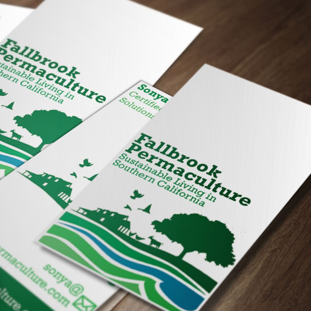
In 2014, I undertook a full branding project for Fallbrook Permaculture. The logo captures that this is permaculture with the swales going with the land instead of against. I expanded the logo into all of the branding & marketing to create a unique cohesive style.
For this project, I first learned a little about permaculture and how that means farming with the land and around old hardwood or topographical features. Fallbrook also wanted to incorporate some animals and an antique farmhouse they had on their property into the logo, so with that information I came up with not so much a logo, but a kit of parts that could be used across marketing including color keys and the color theory behind the colors I selected and icons that could be used to convey the various benefits of permaculture. I also included a text based logo in a handmade, vintage-looking font that evokes yesteryear.